The saying that all PowerPoint developers should keep in mind is, “Just because you can, doesn’t mean you should.” Almost all software development tools give you amazing features that allow you to create awesome content. But a presentation full of awesome features, animations, colors, and fonts doesn’t always make a good presentation. Here are 6 simple things that will improve your presentation and benefit your audience.
1. Font Size and Type:
When presenting keep in mind that your audience is a lot further away from the screen than you were while you were creating the presentation. So to make sure your audience can comprehend what is being presented, never insert text into your presentation that is smaller than 24pt.
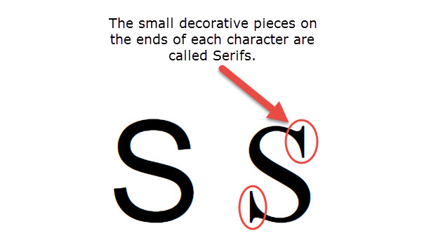
Not only does font size help with comprehension, but font type plays a huge factor as well. As a general rule, never use any fonts with serifs (the fancy projection finishing off a stroke of a letter) or any fonts that resemble papyrus (I’m looking at you, high school kids). While these types of fonts may look great close up on a computer screen 17 inches from your face, the same clarity and understanding doesn’t translate when you are 15-20 feet away. And to help create a sense of unity within the presentation, never use more than two font types: one for titles and headers, and the other for body text.
2. Labels:
A procedure that may seem mundane and worthless like labeling all your graphs, tables, charts, and etc. makes a huge difference when presenting to an audience. Again, they don’t know the content as well as you do and you have to walk your audience by hand through the information. This is especially important when it has to do with the type of content that is generally presented in tables and charts (lots and lots of numbers).
3. Consistent Backgrounds:
When it comes to backgrounds, there is definitely a method to the madness. Good presentations ameliorate content with backgrounds that don’t detract from the flow of the presentation. And good presenters will interchange between one or two different backgrounds depending on the information shown on screen. If this is done consistently, you will almost always know what kind of information is being displayed because the presenter defined it through the correlation of the content and the background.
4. Contrast:
This tip goes hand in hand with tip #1 and #3. If you are set on using certain font types and colors in your presentation, make sure that your content is always easy to read after the background images are applied. Always go back through your presentation and locate the trouble spots and mask your text with a darker (or lighter) shape. This will allow you to keep your background selection and create a presentation that is easy to read and digest.
5. High Quality Images:
7 words: Absolutely use nothing that resembles clip art. This will be easier to do now that PowerPoint has drifted away from using it. I don’t know how hard I need to try and convince you not to use it, but in case you do like using it, here is a bulleted list of why you should never use clip art in a presentation ever again.
- Childish
- Overused
- Not professional
- You can do so much better
- Audience won’t take you seriously
- Etc.
Presenting and presentation is headed to a more simplistic and modern approach to design. Clip art is stepping back into the 90’s. You can tell better stories and give better examples by using high quality images. And if royalties and licensing scares you, go to eLearning Brothers and use some of our 2 million royalty free assets! It pays to to look for the perfect image.
6. Duplicate Final Slide:
While perusing the internet this last week I found a rather peculiar tip, it was to duplicate your final slide in its final state (meaning what it would look like without any animations or transitions) so that you never accidentally double click and skip to the black screen of death before it is time. This is such a simple tip that creates a huge safeguard when presenting at prestigious conferences or in front of your CEO.
Whether or not you deliver an effective presentation is decided long before you stand in front of an audience. It is decided during the production of your presentation. So take the time and give the time an awesome presentation deserves. Do you have any tips for creating an awesome presentation that you would like to share? Comment below!